
HOW YOUR BRAND ARCHETYPE CAN INFLUENCE YOUR VISUAL IDENTITY
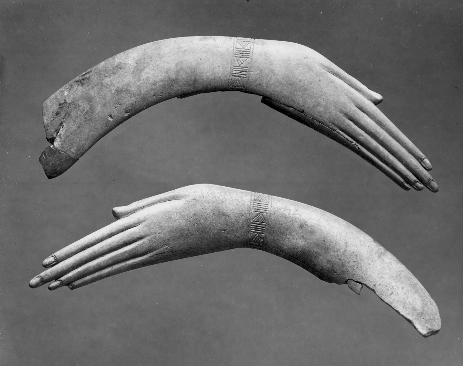
Brand Archetypes are just symbols for fundamental human needs.
Humans always need something. It’s actually quite difficult to keep humans content and happy (for long, anyway). We are always running into problems, some better and some worse.
This is often referred to in marketing as a ‘pain point’. Have you ever noticed that you yearn for something, only to get it, and then a month later you’re pining for something else? Welcome to the human condition…
So what are these needs? It turns out, they are fundamental and so they are predictable. Based on many years of psychological observation and research, people essentially oscillate back and forth between these four motivators: Structure (I need safety), Connection (I need to be accepted by people), Individualism (I need to do my own thing), and Spontaneity/Possibility (I need to push the boundaries and reach for more).
Why do we fly back and forth between these opposite characteristics? Because we need all of them in good balance. Like nature; we are always gravitating back toward balance.
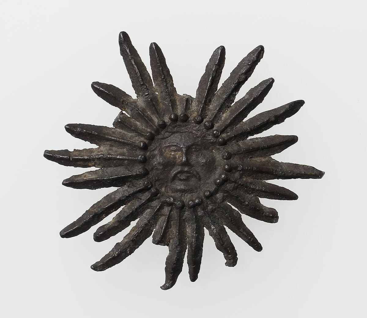
Pilgrim's Badge with Sun with human face 15th century - MET Museum
‘But don’t these aspects seem kind of… basic?’, you say…
Well, while we are not cave-humans searching for shelter and berries anymore (if you’re lucky) it’s easy to see that all of our desires still really do stem from these motivators when it boils down to it.
The need for safety, to be a part of a collective, to work on ourselves, take risks or evolve, and to be romantically or platonically desired by others are pretty much hardwired at this point, and they helped us survive at the end of the day. And most products and services deliver on one or multiple of these needs (or at least insinuate that they do).
So how on earth does this all relate to visuals? If we take into account that these needs are subconscious at this point (we don’t really know why we crave stuff, it feels automatic or ‘natural’), branding and all visual SYMBOLS also operate at a subconscious, cultural level. We have associations, presumptions, and biases towards things based on how they make us feel or what we have experienced in the past, and there are lots of COLLECTIVE biases, which is where Archetypes come in.
To quote The Hero and the Outlaw: “People with a strong stability orientation are drawn to shapes that are square, arguing that physical shapes have an archetypal quality to them.” Perhaps because squares simply ‘are’ more sturdy, or we’ve formed an association because of our societal expectations. Regardless, the meaning is there. So in a nutshell, archetypes don’t just relate to a ‘persona’ - they can be applied to colors, shapes, and visuals - which is where they really shine in branding.
Explorer brands embody freedom and discovery, which translates visually into rugged textures, expansive layouts, and earthy, natural tones. Hello, outdoor brands like Patagonia. Hero brands exude strength and resilience, embodied in bold typography, structured layouts, and strong, defined lines. Sounds a bit like Nike? Sage brands are intellectual and insightful, portrayed through structured layouts, understated colors, and classic fonts. Perhaps like Aesop?
Knowing your archetype not only totally underpins your written strategy; it also makes your visual language viscerally clear and makes for a smoother design process that you can clearly explain to a client.
If you want some guidance about your unique Brand Archetype and dive deep on strategy, book a strategy session with me.
Images from:
https://www.brooklynmuseum.org/
https://www.metmuseum.org/art/collection/search/469969